
Description
- Mixed-media digital collage
- 18 inches wide, 24 inches high
Publication Date
10-13-2020
Keywords
pandemic, graphic design, digital collage, poster, Chicago
Disciplines
Art and Design | Graphic Design
Recommended Citation
Cahill, Laura, "Laura Cahill: 1918 & 2020 Pandemic Poster" (2020). COVID-19 Graphic Design: Posters. 40.
https://ecommons.udayton.edu/stu_vad_covidcollage/40

Comments
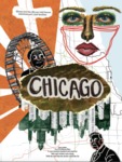
The inspiration for my poster came from my history final from the spring 2020 semester, when COVID-19 was new to our lives. We were assigned to write about how different cities were affected by the 1918 pandemic. When this current project was presented, I immediately thought about the website I had previously used while doing that final. I enjoyed researching and seeing images of different cities and the culture of them during the last pandemic. I wanted to choose a city that was personal to me, so as a proud Chicagoan, the decision was easy to make. I wanted to have a connection with the city so I could include information that was relevant to what I had experienced the last few months. In my poster, I wanted to convey the culture of Chicago during both pandemics and how they caused the city to “turn upside down.” I included the skyline in multiple media and rotated them facing down to highlight that idea. I also added the Ferris wheel from Navy Pier, which I felt like was a crucial part of Chicago’s sites as well as a representation of the ongoing and repeating feeling that most people were and still are experiencing. The part of my poster that I feel that connects the time periods the most is the two drawn men. The man on the top is Chicago’s current governor; the man at the bottom was the city’s health commissioner during the Spanish flu pandemic. Both men were highly criticized for their decisions regarding Chicago during the pandemics. They weren’t taken seriously, so I added googly eyes to make them seem less serious and seem like a joke. I tried to connect all the images through placement and color to add interest and clarity. I enjoy collaging off screen, so I wanted to include mixed media so the poster didn’t feel so flat. I did a lot of off-screen making, from the traced train lines in the background to the oil pastel “selfie.” The texture in edges of ripped paper also interested me a lot, so I included that in the center to hold the word "Chicago," and in past iterations, I placed pictures of masking tape to add another layer of dimension. I had the idea of having a mix of digital and analog style from the beginning, but my original was not reaching the levels I wanted to.
Deciding to go in another direction was probably the most difficult part of this project for me. I had spent weeks creating my original idea, and I didn’t want to part with all of the work I had been putting in since the beginning of the school year. I am content with my choice because I am much more proud of my final piece. It is so easy for me to get caught up in one idea. Taking a step back and analyzing my piece, I realized I was having a creative block because I was too invested, and I didn’t have a direction to go in.