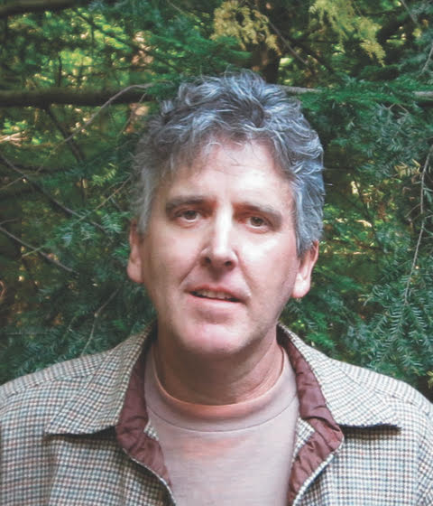
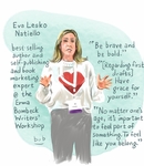
Cartoonist Bob Eckstein was the artist-in-residence for the 2022, 2024 and 2026 Erma Bombeck Writers' Workshops. He "live-drew" the workshop, providing illustrations of keynote speakers, presenters, attendees and events.
Eckstein is an award-winning New York Times bestselling author, New Yorker cartoonist and New York University adjunct professor. View his website. To read his notes for each drawing, click on the image or title in the gallery below.
Artist statement
Before my first visit to the annual Erma Bombeck Writers’ Workshop, I prepared by researching who the speakers were and sought out photos of them online. Before my plane landed in Dayton, Ohio, I did some pencil sketches of some of the speakers to warm up and get myself familiar with my subjects and practice drawing them. All the other drawings were executed on the spot. I sat in on as many sessions as I could; I started the illustration during the class and would finish the drawing about the time it concluded. The drawings were done on an Apple iPad Pro with Apple Pencil. I used the absurd software Art Set.
I was enjoying taking the classes myself. I teach humor, writing and drawing in colleges around the world (this year at NYU, New York City; Marywood University, Pennsylvania; and Yonsei University, South Korea), but I learn more than anything else. I learned a lot from my class hopping at the workshop, so I was taking notes and searching for takeaways to add to the drawings. Without my quotes, I feel the drawings lack context and are merely snapshots of a moment. I want all my creations to share what I learned.
-
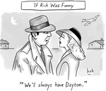
Cartoon: "We'll Always Have Dayton"
The Casablanca cartoon was my attempt to create an inside joke for all of us. I did cartoons to use as filler while I raced to finish the illustrations of speakers. But I also felt the cartoons were more appropriate in this case where all the attendees want to laugh.
-
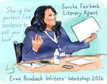
Illustration: Sorche Fairbank
Sorche. What a cool name. And I really enjoyed meeting her. She was cool and had an edge. We have a small connection in that she represents a New Yorker cartoonist, someone I know, and I found out she’s pretty well-versed in the world of gag cartoons.
-
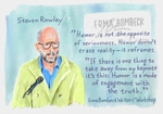
Keynote Illustration: Steven Rowley
Steve was a real gentleman to meet. I ran into him late at the hotel restaurant, and he seemed genuinely pleased with the drawing, although he doesn’t come off as someone who would place much importance on a drawing of himself. Pretty laid back.
-
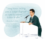
Illustration: Brandon Follick
Brandon and I actually became fast friends before the conference, as we were both stranded together in a New York City airport. What better way to pass the time than to chat with someone as knowledgeable as Brandon about comedy? I’m hoping we keep in touch.
-
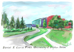
Illustration: Daniel J. Curran Place, University of Dayton, 2026
This is honestly my least favorite drawing. I wanted to do a nice job rendering the venue, but this was at a frantic part of my schedule, and I had a very short time to do it. I didn’t have a good angle, and I sometimes swing and miss. Hopefully, some will disagree and think I’m wrong.
-
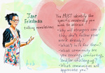
Illustration: Jane Friedman, 2026
I often include Jane Friedman in my drawings because I seldom miss any of her sessions. I had the opportunity to know Jane, and most importantly, Jane is a favorite in the publishing community. In this case, I was drawing another speaker scheduled the same time, and I ran into Jane’s session halfway in. When I sat down, the attendee sitting next to me told me I just missed my Substack being discussed, in a positive way, in her workshop. For this drawing, I wrote down some of the talking points and took a photo of Jane to use as reference—I was way in the back. The drawing was going great when a computer glitch erased the drawing! This is a redraw from memory. I think it’s good. But the original was really something.
-
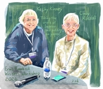
Illustration: Kathy Kinney and Cindy Ratzlaff
Kathy and Cindy have been very sweet and appreciative of this drawing. People love their classes!
-
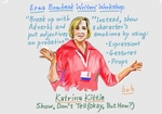
Illustration: Katrina Kittle, 2026
Katrina is someone I’ve drawn through her different hair styles! And hair colors! She’s a speaker with great command of the room.
-
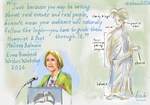
Illustration: Melissa Balmain
So glad I got to meet Melissa and would have wanted to chat with her more—she’s a real pro and very funny. I had her books before I even knew we would meet.
-
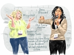
Illustration: Missy Hall and Dena Blizzard
I'd never met Missy and Dena, and I spent only a couple of minutes talking with them, but I enjoyed their class, and they were cool to draw.
-
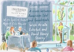
Illustration: Pitchapalooza — Arielle Eckstut and David Henry Sterry and Special Guest Agent Erin Hosier
This couple I ran into in a hallway and I just knew I’d have to make sure to draw them. Very dynamic, very likable. And spot-on helpful in their session.
-

Illustration: Tiffany Yates Martin, 2026
Tiffany is great to draw, and that comes through in all the artwork over the years. She is a force of nature as a teacher, and I personally have greatly benefited from her books.
-
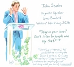
Keynote Illustration: John Searles
I spoke to John regarding Helen Brown, someone John knew well. I dealt with her family because I included her in my new book. I sent John an excerpt from the book along with the drawing of him. I’m not sure what he thinks!
-
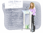
Keynote Illustration: Sona Movsesian
I coincidentally sat next to Sona for lunch. She was nervous about her speech, and I told her nobody in the room was more ready, more qualified to give the speech than she was. And she did fantastic.
-

Cartoon: Client and Therapist
Cartoons are my wheelhouse and something easier because most of the work there is the idea. That’s 90% of it, and I can be working while eating breakfast or walking between classes or whatever. I can do three cartoons in the time it takes to do one illustration.
I quite like this simple cartoon.
-
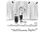
Cartoon: '"Helllllloooooo, Dayton!"
Cartoons are my wheelhouse and something easier because most of the work there is the idea. That’s 90% of it, and I can be working while eating breakfast or walking between classes or whatever. I can do three cartoons in the time it takes to do one illustration.
I quite like this simple cartoon.
-

Cartoon: No aisles
Cartoons are my wheelhouse and something easier because most of the work there is the idea. That’s 90% of it, and I can be working while eating breakfast or walking between classes or whatever. I can do three cartoons in the time it takes to do one illustration.
The idea for this one has been in my head for about 10 years. But never more appropriate.
-
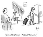
Cartoon: Off to Dayton
Cartoons are my wheelhouse and something easier because most of the work there is the idea. That’s 90% of it, and I can be working while eating breakfast or walking between classes or whatever. I can do three cartoons in the time it takes to do one illustration.
This one is maybe funny because it’s true.
-
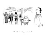
Cartoon: "Worst. Emotional. Support. Cat. Ever."
Cartoons are my wheelhouse and something easier because most of the work there is the idea. That’s 90% of it, and I can be working while eating breakfast or walking between classes or whatever. I can do three cartoons in the time it takes to do one illustration.
This was an old cartoon I dusted off.
-
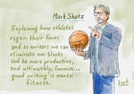
Illustration: Mark Shatz, 2026
This is a drawing of my friend Mark. I was blown away by his class—it came out of left field how he explained the emotional and mental elements in developing our writing confidence. I almost forgot I was there to draw him!
-

Illustration: Marriott at the University of Dayton
Simple drawing of the hotel. It was a good angle, so this came out well.
-
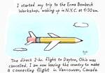
Cartoon: NYC to Dayton ... via Vancouver
Artist's statement about this piece: This was a drawing I did in the airports while dealing with flight delays and shuttling all over. It’s exaggerated for the sake of humor but not far from the truth.
-
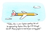
Cartoon: "Please Prepare to Meet All Your Writing Goals"
Artist's statement about this piece: I have no memory of this new joke except to say it sounds like one of my jokes.
-
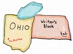
Cartoon: You Are Here
Artist's statement about this piece: This was the first drawing, done well before the conference and pitched as an idea for the conference T-shirt, which I was thinking should be something silly yet cerebral. I did a handful of ideas, and this was the most primitive. The reaction to this was very positive. It does in a subtle way convey the sentiment of converging here in Dayton to overcome any blocks one might have as a writer.
-
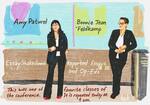
Illustration: Amy Paturel and Bonnie Jean Feldkamp
Artist's statement about this piece: I was surprised to learn that these two women didn’t know each other before the conference because I thought they had chemistry, and both had a similar level of professionalism and spark. I have since kept in touch with both of them, and we hit it off so well they expressed interest in collaborating down the road in some capacity. And I like the drawing. The minimal shapes and forms in the background reflect their no-nonsense approach to dispensing what they know.
-
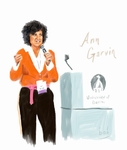
Illustration: Ann Garvin
Artist's statement about this piece: Ann is electric, and despite running out of time and being unable to draw her, I knew I had to find a way before I left Dayton to do a drawing of her. Great workshop. I blurbed her new book, Bummer Camp. Very funny.
-
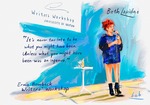
Illustration: Beth Lapides
Artist's statement about this piece: Most embarrassing moment of the conference: While Beth was performing, she said a key word or password which inadvertently triggered my device to turn on Siri and prompting the computer to ask what I wanted and interrupted Beth mid-sentence. She asked what happened, and I blurted that my computer heckled her, or something to that effect. I wanted Siri to help me crawl into a hole. I apologized later, and I took my time executing her drawing to make up for the horrible distraction I created. I THINK all is forgiven, and Beth is happy with the drawing.


