Students of Misty Thomas-Trout, associate professor of art and design, created the posters in this gallery for the Dayton Metro Library exhibition Life in Letters: A Typographic Poster Exhibition Featuring Paul Laurence Dunbar, on display in the Main Library’s Opportunity Space at St. Clair Oct. 23 through Nov. 19, 2023.
The artists studied the letters of Dunbar, the world-renowned poet from Dayton, then chose typefaces that would celebrate and honor his life. A community reception was held Friday, Nov. 17.
The works feature typography created by artists of color.
-
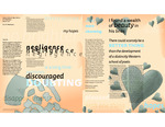
From Despair Comes Future Hope
Ainsley Betz
Dimensions: 30 inches wide, 36 inches tall
Medium: Inkjet on matte paper, printed on both sides
Work displayed here as a diptychArtist's narrative: Letter 3 was written to Dunbar’s friend and mentor Dr. James Newton Matthews. The letter focused on Dunbar’s despair following his publication and recital at the Western Association of Writers Conference, where he was not able to sell any of his poems. This caused him to doubt himself and his ability. The color blue was used to represent these feelings of sadness and self doubt. Negative words were pulled from the letter and applied at various line weights and opacities to further emphasize how Dunbar’s negative thoughts were overpowering him. The imagery of torn paper also represents his feelings of failure as the pieces are falling away and hitting the bottom of the poster. The letter transitions to a more hopeful note as Dunbar recounts his admiration for Will Pfrimmer’s Driftwood and the prospect of the developing world of Western poetry. The opposing side of the poster features the color orange with text that reinforces the feeling of hope that becomes evident later in the letter. The repeated hearts represent Dunbar’s Admiration for Pfrimmer and John Clark Ridpath, whom he met at Western Association of Writers Conference, and more positive and optimistic words and phrases were chosen to populate the page and reflect the more positive tone of the latter half of the letter. The type palette consists of Vendetta by John Downer and Tisa Sans Pro by Miklavcic.
-

Love and Family
Kevin Brun
Dimensions: 30 inches wide, 36 inches tall
Inkjet on matte paper, printed on both sidesArtist's statement: Letter 92 is Paul writing to his mother, Matilda, during his voyage from New York to England. Due to Dunbar’s dedication and love for his mother, he was writing to let her know that he had a rough trip but is doing well. Dunbar was on his way to London to sell his book Lyrics of Lowly Life after he got the approval and recommendation from William Dean Howells—who at the time was known as the “Dean of American Letters.” Near the end of Dunbar’s letter, he lets his mother know that he is engaged with Alice Ruth Moore. Dunbar and Alice had been in a relationship via letters for two years before meeting for the first time the night before Paul left on this trip. This poster emphasizes the ideas of love and engagement with one side focusing on family love while the opposing side focuses on Dunbar’s love for Alice.
Typography information: The type palette consists of Brioso Pro (old face) and Cronos Pro (humanistic lineal), both created by Robert Slimbach. They evoke the feeling of the mark of the human hand.
Other elements: The additional lettering was handwritten. The use of watercolor emphasizes and symbolizes the water from the Atlantic. The holding hands illustrate his loving relationship with his mother, and the ring symbolizes his engagement with Alice, which was one of the happiest days of his life.
-
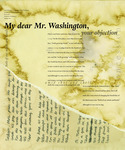
I Object
Caroline Creamer
Dimensions: 30 inches wide, 36 inches tall
Inkjet on matte paper, printed on both sidesLetter 166 Paul Laurence Dunbar wrote to Booker T. Washington in response to his rebuttals of the commissioned song Dunbar was asked to write for the Tuskegee Institute. The Tuskegee Institute was the first higher education institute opened for African Americans. Booker T. Washington was one of the founders who helped establish the school. During the time of this letter, Dunbar was struggling with his tuberculosis diagnosis, however he was still writing and producing new work. Within this letter Dunbar debates Washington’s views and objections to various lyrics in which Dunbar believes are correctly placed and worded. One of the most important aspects of this reading is the relationship between Dunbar and Washington. While they had different views on the song it is made clear that Dunbar still has the utmost respect and admiration for Washington. Even within those feelings of great admiration, Dunbar still stands his ground and fights for the original written version of the song. This letter shows a confident side of Dunbar as he defends his work. The type palette is Adriane Text designed by Marconi Lima and IvyOra Display designed by Jan Maack. These type families were chosen because of their designers and the overall look and feel which was aesthetically pleasing and helped convey the overall message.
-
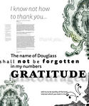
Grateful but Discouraged
Noah Davisson
Dimensions: 30 inches wide, 36 inches tall
Inkjet on matte paper, printed on both sidesArtist's narrative: Letter 21 is from Paul Laurence Dunbar to Frederick Douglass, expressing his thanks to Douglass for his help in Chicago. Dunbar was showing his gratitude toward him and his wife and how he would not forget their kindness. Dunbar goes on to explain that he is not doing well mentally and that the people in his town did not support him — especially after he came back from Chicago. Dunbar explains how news of him getting thrown out of a hotel for being drunk got back to his hometown of Dayton, Ohio. He continues to talk about how he cannot get work, and when he tries the people say that he should have "stayed in Chicago." When a republication of an article about Dunbar showed up in a Dayton newspaper, he was further discouraged from his work. He ends the letter saying that he can only go to Douglass for help. This poster aims to represent Dunbar's gratitude for Douglass's help and to represent all of his discouragement resulting from now being able to work and from his peers crushing his aspirations.
Dunbar was in his home when he wrote this letter, which is why I chose the imagery of the wallpaper from his home in Dayton. The typefaces used in this poster are Tisa Sans designed by Mitja Miklavic and Mrs Eaves designed by Zuzana Licko.
-
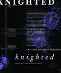
Irrevocable Harm
Sebastián De León
Dimensions: 30 inches wide, 36 inches tall
Inkjet on matte paper, printed on both sidesArtist's narrative: Can one experience extreme joy and fear simultaneously? In Letter 62, Dunbar writes to William D. Howells to express his gratitude for the praise he received in Harper’s Weekly. Howells was a prominent Ohioan publisher, editor, and writer during Dunbar’s time. His review of Dunbar’s Majors and Minors is attributed as a major step in Dunbar’s career, as it awarded the Daytonian poet with great recognition. However, though Howell’s article portrayed Dunbar as a great and talented artist, it also painted his race as inferior. The tension between Dunbar’s joy for his career and the denigrating language used by Howells was the guiding design principle for this poster. A graphite and chalk sketch of roses, based on the wallpaper of Dunbar’s home, was used to express the joy of the moment. Meanwhile, the thorns represent the fear of being talked down to and the irrevocable harm that transpired. Variations in opacities both within the images and typography play off the tension between this joy-fear relationship. The poster uses the type families of Corundum, designed by African American typographer Joshua Darden, and Prenton, constructed by English designer Roy Preston. This type palette was chosen to complement the elegance and anxiety of the background imagery.
-

Uneventful
Mary Dent
Dimensions: 30 x 36 inches
Media: Inkjet on matte paper
Created using Adobe InDesign, Adobe Photoshop, ink, and handwritten calligraphyArtist's statement: Letter 85 was written to a woman who is still unknown to this day. The opening sentence of the letter states, “In answer I must say that my life has been so uneventful that there is little in it to interest anyone.” Paul Laurence Dunbar wrote this letter explaining the “uneventful” occurrences that he had experienced, beginning at his birth in Dayton, Ohio. Dunbar continues on in the letter brushing through age 12, when he first began writing, then to age 14, which was the year of his first publication. Throughout the letter, Paul lists all of these great accomplishments that some can only dream of having, yet he can never seem to give himself the credit he deserves, hence the title.
Typography palette: The two typefaces aid in readability, but also allow for a more personal feeling to the letter. The calligraphy-based typeface Annabelle JF was constructed by Jason Walcott. The other typeface used is Big Caslon CC, designed by Matthew Carter. It is all presented on an aged-looking page that was created to resemble the paper on which Dunbar’s letters were written. The overall message and tone of this piece unmasks the modest and almost unknowing outlook that Dunbar saw his life to be.
-
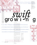
Growing Pride
Elaina Doggett (Lainey)
Dimensions: 30 inches wide, 36 inches tall
Inkjet on matte paper, printed on both sidesArtist's narrative: Letter 166 unfolds Paul Laurence Dunbar’s reaction to a critique he had received by Booker T. Washington regarding "Tuskegee Song," which Washington commissioned Dunbar to write. In this song, Dunbar discusses the triumphs and tribulations of the past, present, and what would come in the future. The poster title “Growing Pride” represents both the South’s pride and Dunbar's. He was unapologetic in his response to Washington and stood firm in his beliefs that his original writing was most effective. The imagery is a stamp traced and cut on foam, inspired by the pattern of the carpet in Dunbar’s study. White floral curtains — mimicking the ones found in his study — were incorporated in the overlay on the stamp to bring in the theme of time. These two images combine to visualize how the room looks from floor to ceiling — symbolizing the confidence and inner strength that fully embodied Dunbar at the time of writing this letter. The type palette is Acumin, designed by Robert Slimbach, and Legitima, designed by César Puertas. The pairing of these allows for structure yet individuality. The italics and modulation of Legitima draw connections to Dunbar’s humanistic writings.
-
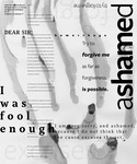
The Act
Erin Doherty
Dimensions: 30 inches wide, 36 inches tall
Inkjet on matte paper, printed on both sidesArtist's narrative: Letter 121 explores the struggles Paul Laurence Dunbar faced with alcoholism and the scrutiny he received for his illness. As Dunbar writes an apology letter to Professor P.M. Pearson for his absence due to excessive drinking, his sincere apologies shine through. Dunbar explains how he is aware that his apology can’t erase showing up to a recital intoxicated, which led to his career being tarnished; however, he still asks for forgiveness. The imagery was created with an ink-water solution. This allowed for an experimental result that provides the somber and colorless atmosphere. Hand clawing for forgiveness was a reality for Dunbar because of his alcoholism. There is imagery relating to his fight for forgiveness and the alcohol itself as it stained both the paper and his reputation. The type palette is Capitolina (serif), which was designed by Christopher Hammerschmidt and Marconi Lima (Brazilian), and FreightSans Pro (sans serif), designed by Joshua Darden (African American). Choosing typefaces that celebrated diversity was an intentional decision.
-

Gratitude and Desperation
Kevin Figueroa
Dimensions: 30 inches wide, 36 inches tall
Inkjet on matte paper, printed on both sides
Work displayed here as a diptychArtist's narrative: In letter 21, Paul Laurence Dunbar is reaching out to his friend Frederick Douglass. He is sending his gratitude for all the help Douglass provided Dunbar, but also seeking some words of wisdom to deal with some backlash Dunbar is receiving back home in Dayton.
-

Nervous Conditions
Laurel Grelle
Dimensions: 30 inches wide, 36 inches tall
Inkjet on matte paper, printed on both sides
Work displayed here as a diptychArtist's narrative: Letter 174 is addressed to Paul Laurence Dunbar sent from his dear family friend H.A. Tobey. Toward the end of his life, Dunbar struggled to cope with his tuberculosis and turned to alcohol to ease his pain. As his condition worsened, Tobey began to worry about him and wrote him this moving letter of optimism expressing his sympathy regarding Paul living with a painful and deadly disease. The mirroring is showing the side effects of the disease and complications it causes to the spine and nervous system. Having the visual spread outward all throughout the page and enclosing the type further conveys how tuberculosis was taking over his body. Watercolor combined with digital illustrations created an overall feeling of being nervous and desolate — similar to the emotions of Dunbar in 1902 battling tuberculosis. The poster sheds light on the physical and mental struggles Dunbar faced in his medical condition. It shows the undeniable past experiences that have led up to this feeling of distress. The time period in which Dunbar lived and the tone of the letter’s message influenced the type palette choices of an old face and humanistic lineale. Dupincel (oldface) was designed by Rodrigo Saiani; Laca (humanistic lineal) was designed by Joana Correia.
-
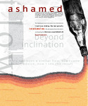
Similar Flow
Quinn Heisey
Dimensions: 30 inches wide, 36 inches deep, 2-sided
Medium: Inkjet on matte paperArtist's narrative: Contemporary readers of letter 121 are hearing from the great Dayton poet, Paul Laurence Dunbar, in a declining state and nearing his 1906 passing from tuberculosis [diagnosed 1899]. Dunbar's illness necessitated treatment in a time before antibiotics, and the popular treatment was to use whiskey to manage extreme pain. This contributed to Dunbar’s addiction to alcohol, which is context for the sometimes unclear nature of events and decisions of his that warranted Dunbar to issue this response.
The letter has moments of self-disparaging humor or sarcasm and is plagued with a frankness and profuse apologies of wrongdoings, all to Professor Pearson. This feeling of anxiety and shame, yet high spirits amidst rough rough times, comes across as sincere to the reader. This genuine outpouring of honesty and humiliation is represented on the poster through the typographic texture pouring out of the hand-drawn whiskey bottle.
The type palette includes Alegreya (serif), by Juan Pablo del Peral from Argentina and Petala Pro (sans-serif) designed by Marconi Lima from Brazil, and were selected via direct inspiration of faces used in The Dayton Tattler, published by Dunbar.
-

More Kind to Me Than Just ...
William Kentopp
Dimensions: 30 inches wide, 36 inches tall
Inkjet on matte paper, printed on both sidesArtist statement: In Letter 62, Paul Laurence Dunbar writes to the famed literary critic William Dean Howells to show gratitude after he reviewed Dunbar’s Majors and Minors. This review was a turning point in Dunbar’s life and would skyrocket his career onward. Howells gave Dunbar great recognition for his literary style and the use of dialect but would also actively undermine his race in his praises. While Dunbar was grateful for the review, he was less enthused by how he was portrayed as an African American. Howells used racist language in his review, "separate but equal," which is the fundamental structure of this poster. While he saw Dunbar as an excellent writer, he wanted him to strictly write in colloquial, informal English where he believed Dunbar was “most himself."
Typography: This poster uses transitional and humanistic lineal typefaces to reflect the same transitional phase Dunbar was experiencing at this point in his life, where he was overcome with excitement and fear.
-

Sincerely Yours
Emily Kintz
Dimensions: 30 inches wide, 36 inches tall
Inkjet on matte paper, printed on both sides
Work displayed here as a diptychArtist's narrative: Letter 62 unfolds William D. Howells’ review of Majors and Minors and the impact it had on Paul Laurence Dunbar. This single review pushed Dunbar into the national spotlight, which made his career. Howells' review, however, was embedded with racist ideologies and misinterpretations of Dunbar’s messages. The use of blue watercolor in the foreground represents the depth Dunbar put into his work. The purple watercolor begins to flood into the imagery to express the power Howells had over Dunbar in this single review. The flowers spreading across symbolize the way Howells rooted himself into Dunbar regardless of the success that was brought upon him. One side portrays the sense of gratitude Dunbar had from the review, while the other half displays the harsh reality of the damage Howells' single review did to him. The type palette paired with this imagery consists of Adriane Text designed by Marconi Lima and Work Sans distributed by Google Fonts. This transitional and grotesque pair creates stability in the imagery to showcase the power Howells will forever hold over Dunbar.
-

I Am Doing for the Best
Elaina Lear
Dimensions: 30 inches wide, 36 inches tall
Inkjet on matte paper, printed on both sidesArtist's narrative: Letter 66 expresses Paul Laurence Dunbar’s loving relationship with his mother, Matilda, and how his distance away from home worried her. Dunbar explained how his writing career was successful and that wealthy white people were treating him well; therefore, she did not need to worry. One side of the poster reflects the beginning of the letter; it's painted with ink wash representing the home where Matilda resided in Dayton, Ohio. The opposite side represents the Everett House in New York, where Paul was when he wrote this letter. The chaotic text surrounding the edge highlights the relationship between Paul and his mother. The abundance of text symbolizes the worrying that Matilda is feeling about her son being away. The crinkled paper texture with pencil-drawn outlines portrays the letter itself and illustrates the feeling of sending and receiving a handwritten letter. The transitional typeface Freight Text, created by African American designer Joshua Darden, displays the handwritten aspect of the letter. The grotesque typeface Meta Headline, designed by Christian Schwartz, Erik Spiekermann, and Joshua Darden, mirrors the relationship of Darden collaborating with white peers and Dunbar collaborating with white peers.
-

The Gratitude I Really Feel
John Maloney
Dimensions: 30 inches wide, 36 inches tall
Inkjet on matte paper, printed on both sides
Work displayed here as a diptychArtist's narrative: In Letter 10, Paul Laurence Dunbar articulates his gratitude to a friend, Dr. James Newton Matthews, on the day before Thanksgiving. Matthews was a doctor and poet and one of the cofounders of the Western Association of Writers (WAW). When Dunbar read his poetry at the annual conference of the WAW, Matthews was so impressed that he wrote a newspaper article about him. The story was widely republished, bringing greater attention to Dunbar and his work. This letter that Dunbar sends to Matthews carries two messages, acknowledged on either side of the diptych. The first message exhibits Dunbar’s extensive appreciation for the donations he received to have his book published before Christmas. This is portrayed in the poster against a white background with multiple phrases that emphasize Dunbar’s gratitude to Matthews. With heavier emotion, Dunbar also explains that his success is solely dependent on those who have donated and supported him. His apprehensive tone throughout the letter is rooted in the uncertainty of being able to repay the contributors of his work. This feeling is expressed in the rough charcoal texture that composes the background imagery. The type palette used in the diptych consists of Freight (transitional) and Freight Sans (humanistic lineal), both designed by Joshua Darden. Darden, an African American, worked closely with Timothy Glaser, a white man that Darden had been friends with since high school. Their relationship reflects Paul Dunbar’s friendship with Dr. Matthews as they worked to publish Dunbar’s poetry from his teenage years into his early adult life.
-
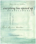
Everything Has Opened Up Auspiciously
Lucy Miles
Dimensions: 30 inches wide, 36 inches tall
Inkjet on matte paper, printed on both sides
Created using Adobe InDesign, Adobe Photoshop, watercolor, and handwritten calligraphyArtist's narrative: Paul Laurence Dunbar's Letter 74 is a beautifully composed note to his mother that focuses on his journey aboard Steamship Ambrosia. Dunbar starts his letter off by addressing his determination and hope that “everything [is] opening up auspiciously” and goes on to describe the trials and tribulations that he is facing. Through the delicate media of watercolor and intricate typography, the delicacy of human life is showcased while emphasizing Dunbar's positivity and determination. The type illuminates the complexities and interplay of Dunbar's emotions alongside the muted colors that transition into more dark and gloomy tones. Intertwining the typefaces Adriene and Patelo, designed by Marconi Lima, helps emphasize the formality and emotion within his letter to his mother.
-

The Elevator Only Goes Up
Jordan Mitchell
Dimensions: 30 inches wide, 36 inches tall
Inkjet on matte paper, printed on both sidesArtist's narrative: This letter takes Paul Laurence Dunbar back to when he was not proud of his work. In high school, he thought all of his writing was one big joke. He could not afford much, which led to him being forced to take a job as an elevator hopper. In the end, it was a situation that should be seen as a positive. When talking in the elevator with people, he was able to learn how they spoke and put it into his writing. When he finally finished Oak and Ivy, he began to sell his work within the elevator, allowing for additional opportunities to promote his work.
Font palette: FreightNeo Pro, designed by Robby Woodard; AF Lapture, designed by Tim Ahrens
These type families captured what felt like a memory that went much deeper than what was on the outside. Lapture is an old face that represents the flashback of the memory. FreightNeo Pro captures the beauty behind everything Paul Laurence Dunbar has done.
The imagery represents his journey up and down the elevator, capturing the “footsteps” through the first parts of his life. The red throughout the piece represents the bad memories of high school and what brought him to the elevator. The elevator symbolizes the starting point of Dunbar’s career—he could only go up from here.
-
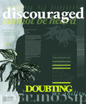
Self-Deprivation
Maddison Mitchell
Dimensions: 30 inches wide, 36 inches tall
Inkjet on matte paper, printed on both sidesArtist's narrative: Paul Laurence Dunbar was a fascinating poet and writer. He was ahead of his time, and his writing was special and loved by all who read it. However, Dunbar was very hard on himself; he talked down about his abilities and writings. In Letter 3, he was writing to a close friend and mentor, James Newton Matthews. He talks about how he is not confident in his writing abilities and is doubting himself, saying he hasn’t been able to sell a single poem. At the time of this letter, he was 20 years old and had already published his first poems at the age of 16 in a Dayton newspaper. My goal was to create a poster that reflected this self-deprecation by creating a drowsy and discouraged poster for the front to show how Dunbar felt about his work. But because others loved his work so much, I wanted to show that conflict by making the back of the poster for people to see and understand how much his work was loved. Dunbar inspired so many people, yet he was very discouraged and doubtful, so the contrast and conflict in my two sides of the poster is meant to show this feeling. The type palette I chose was based off Corundum, which is a transitional face; this was because I wanted to have the mark of the human hand but have it a little more structured and serious because of how serious Dunbar was about his work. I paired it with Halyard, a humanistic, because being human, you are always bound to not see how amazing you are. Having that mark of the human hand brings the people into the work.
-
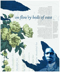
On Flow'ry Beds of Ease
Jacob Owens
Dimensions: 30 inches wide, 36 inches tall
Inkjet on matte paper, printed on both sidesArtist's narrative: In Letter 10, Paul Laurence Dunbar's heartfelt words to his friend J. N. Matthews unveil a profound narrative of gratitude and faith. As a Black man navigating adversity, Dunbar expressed his deep indebtedness to white colleagues who aided in his success. The gentle color palette—featuring dark blues, purples, and soft whites—exudes an antique ambiance, transporting viewers back to Dunbar's era. This color scheme evokes the essence of the time when Dunbar mastered his craft in the cozy confines of his mother's home, where the floral wallpaper inspired the delicate designs on the poster. The floral visuals intend to convey the intricate layers of emotion within this letter, where he diligently practiced his poetry and embarked on his literary journey. The tearing effect reveals the texture reminiscent of Dunbar's first volume of poetry, Oak & Ivy, published one year after this poignant letter. Just as the torn wallpaper reveals the foundation beneath, Dunbar's enduring faith and gratitude is timelessly expressed through the typefaces Vendetta, an old face by John Downer, and Syntax LT, a humanistic lineal by Hans Eduard Meier.
-
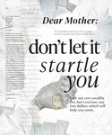
Don't Be Startled, My Dear Mother
Jon Quiroz
Dimensions: 30 inches wide, 36 inches tall
Inkjet on matte paper, printed on both sidesArtist's statement:
In Letter 66, Paul Laurence Dunbar aims to reassure his mother, Matilda Dunbar, not to be so concerned about his whereabouts. He emphasizes that he will return home as soon as he can. Within the letter, he sends a $2 bill to give financial support during his busy schedule of recitals, particularly in the South—a gesture that underscores his devotion to his family’s well-being even in his absence. Dunbar reassures his mother that after gaining great success from his writing, all the financial success he gains from his books would be his commitment to helping his family. Dunbar was so determined to support his family and communicate with others that he took it upon himself to convey meaningful messages in the letters he wrote to important individuals in his life. This course of action served as a cornerstone for Dunbar’s unwavering devotion to his family’s well-being and his artistic pursuits. This poster conveys the overwhelming feeling of success and the peace of mind this gives to our loved ones, especially our mothers.
Typography: To represent the feeling between Paul and his mother, the typeface in this piece is IvyPresto, designed by Jack Maack, a serif type family. For sans serif, the family Optima, designed by Hermann Zapf, was selected to represent the strong structure Paul had when handling his success during his recitals.
-
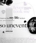
The Uneventful Life
Hannah Schultz
Dimensions: 30 inches wide, 36 inches tall
Inkjet on matte paper, printed on both sidesArtist's narrative: Letter 85 provides Paul Laurence Dunbar’s negative viewpoint on his successes. Although we are unsure who he is writing to, he writes of his accomplishments from early childhood to the present and calls it all uneventful. He starts off by mentioning how he was only published at age 14 and quickly calls it positive trash. He continues to discuss how he was widely loved in high school and was the editor-in-chief of the school newspaper, but he wrote the paper a month late every time. After high school, he began work as an elevator operator. There he wrote his first book, which he notes only sold well within his town. Dunbar seems to be fine talking about his achievements but cannot help to add in negative comments about himself and his work when he is so blatantly talented. This negative viewpoint he casts on himself is metaphorically depicted with the extreme modulation of the typeface Freight by Joshua Darden and is accompanied by the typeface Ingra by Ermin Mededovic.
-
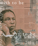
Wish to Be, Try to Be
Madelyn Selong
Dimensions: 30 inches wide, 36 inches tall
Inkjet on matte paper, printed on both sidesArtist's narrative:
Letter 21 details the events Paul Laurence Dunbar experienced following the Chicago World's Fair. Dunbar writes to Frederick Douglass, whom he had made friends with at the World's Fair after reading his poems there. The beginning of the letter tells the story of Dunbar’s gratitude toward Douglass as he promises to try to be worthy of the interest Douglass took in him. The end of the letter has a less positive tone, with Dunbar reflecting on some unfortunate events that occurred at the World's Fair. Dunbar details some of the experiences he faced after the fact. Despite the dejected tone the end of the letter displays, I wanted to communicate a feeling of hope. Dunbar has gone through unfortunate circumstances, yet he looks to Douglass for help or rescue. Black and white graphite is used on top of the tan-toned paper to create a portrait of Dunbar and a scene of three birds. A charcoal drawing of the Haitian Building at the Chicago World's Fair on tracing paper is incorporated around Dunbar and the birds. The portrait and birds speak to the more hopeful message of the letter, while the Haitian Building lightly looms in the background, as it does in Dunbar’s mind. The sans-serif typeface is Macho, designed by Michał Jarociński. The serif typeface is Corundum, by Joshua Darden, an African American type designer.
-
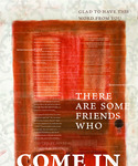
Come In, A Very Clever
Aaron Swerlein
Dimensions: 30 inches wide, 36 inches tall
Inkjet on matte paper, printed on both sidesArtist's narrative: The typeset I chose was in the families of Ten Oldstyle VF, designed by Robert Slimbach, and PestoFresco, by Giuseppe Salerno and Paco Gonzalez.
In letter 198, Paul Laurence Dunbar is sitting in his bed suffering from tuberculosis as he writes a letter to Dr. Fisher. Throughout this letter, Dunbar writes about how he isn’t able to do much because of the tuberculosis disease in his lungs. Dunbar wrote this letter the year before he died, letting Dr. Fisher know his whereabouts and what he does with his time. Dunbar lets Dr. Fisher know there are still family and friends who visit him, but all he can do is lie down in bed. One side of the poster represents the good in Dunbar as he is still welcoming to family and friends, though he must sit in bed for most of the time. The other side of the poster represents certain parts of Dunbar’s late life, such as the drawings he did of the ceiling pattern over and over to occupy his mind. The colored charcoal door drawing represents how Dunbar spent the majority of his time in his room. The door symbolizes the idea of welcoming one inside and feeling closed in on the other side.
-
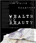
Paul L. Dunbar: A Tale of Two Worlds
Brayden Vaughan
Dimensions: 30 inches wide, 36 inches tall
Inkjet on matte paper, printed on both sidesArtist's narrative: Letter 3 is a poem full of despair and sadness. While Paul Laurence Dunbar does have limited moments of happiness, he is mostly addressing his sorrow and negativity to his friend J.N. Matthews regarding the publication of his work. Dunbar lists his discouragement and blames himself several times throughout his writing. He is very annoyed at himself for his disappointments because he has only been able to sell two of his hymns. He even addresses a statement saying: “But enough of myself and my disappointments,” stating that he believes he is a failure. He does eventually state that he finds happiness throughout his friend's writing, Will W. Pfrimmer's Driftwood. He says: “I have found a wealth of beauty in his lines.” Paul ends his poem saying: “I want to write more, but my bell keeps ringing so I must close; With kindest regards, I am your friend, Paul Laurence Dunbar.” The imagery within the poster symbolizes how Dunbar is running out of time but must continue writing. This is a true reflection of the highs and lows of Paul Laurence Dunbar. The Serif font Typeka is used throughout my posters to represent the typewriter that Paul Laurence Dunbar used. Typeka is designed by E-Lan Ronen and T-26, a digital type of foundry established by Carlos Segura.
-

My Dear Friend,
John Wardzala
Dimensions: 30 inches wide, 36 inches tall
Inkjet on matte paper, printed on both sidesArtist's narrative: Letter 10 was written on Nov. 23, 1892. Dunbar wrote this letter from Dayton, Ohio. The reader can see two sides of Dunbar. Dunbar begins the letter by discussing how he is very thankful for his friend J.N. Matthews. As the letter goes on, Dunbar begins to undermine himself with great self-doubt. While the overall meaning of the letter is uplifting and communicates how thankful Dunbar is for Matthews, Dunbar is conflicted on the inside. The poster design aims to convey his internal conflict. Two topographic layers help describe the struggles of Dunbar. Corundum text was designed by African American designer Joshua Darden. Darden published his first typeface at the age of 15, which is similar to Dunbar being a published author around that same age. The sans serif used is Elido, which was designed by Sibylle Hajman, who was a Swedish immigrant to America.


