In a handwritten letter to her students March 22, 2020, Misty Thomas-Trout, assistant professor of art and design, reflected on the global health crisis that brought about the decision to conduct the remainder of the spring semester virtually, with students and faculty sheltering in place as a the spread of a deadly novel coronavirus grew at an alarming rate.
In this gallery, you can read her letter and browse the works her students created: data visualizations on their encounters with the topic; the "silver linings" they discovered in their isolation; and posters they created to depict the pandemic.
The creator of each work owns copyright.
-

Data Visualization: Brendan Pugliese
Brendan Pugliese
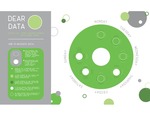
This data visualization project draws from Giorgia Lupi and Stefanie Posavec’s book Dear Data: A Friendship in 52 Weeks of Postcards. After thorough research and note-taking from given and discovered resources, students were asked to respond to the novel coronavirus and the outbreak of its affiliated illness, COVID-19. As designers, students were given the responsibility to deliver information about the current culture while also acting as a participant to history — a primary” source. The object was to document history while also allowing for moments of positivity in the midst of such anxiety and uncertainty.
Students gathered data about every time they heard or read the words “coronavirus” or “COVID-19.” They were told to keep a sketchbook handy at all times. Each time they heard or read one of the phrases, they noted when it happened; what they were doing; whom they were with; and other details. From this, they created data visualizations inspired by the examples in Dear Data.
”You are actually creating a primary source of history for others to rely on in the future,” said Misty Thomas-Trout, assistant professor of art and design. “Try to enjoy this.”
-
Data Visualization: Claire Brewer
Claire Brewer
This data visualization project draws from Giorgia Lupi and Stefanie Posavec’s book Dear Data: A Friendship in 52 Weeks of Postcards. After thorough research and note-taking from given and discovered resources, students were asked to respond to the novel coronavirus and the outbreak of its affiliated illness, COVID-19. As designers, students were given the responsibility to deliver information about the current culture while also acting as a participant to history — a primary” source. The object was to document history while also allowing for moments of positivity in the midst of such anxiety and uncertainty.
Students gathered data about every time they heard or read the words “coronavirus” or “COVID-19.” They were told to keep a sketchbook handy at all times. Each time they heard or read one of the phrases, they noted when it happened; what they were doing; whom they were with; and other details. From this, they created data visualizations inspired by the examples in Dear Data.
”You are actually creating a primary source of history for others to rely on in the future,” said Misty Thomas-Trout, assistant professor of art and design. “Try to enjoy this.”
-

Data Visualization: Drake Dahlinghaus
Drake Dahlinghaus
This data visualization project draws from Giorgia Lupi and Stefanie Posavec’s book Dear Data: A Friendship in 52 Weeks of Postcards. After thorough research and note-taking from given and discovered resources, students were asked to respond to the novel coronavirus and the outbreak of its affiliated illness, COVID-19. As designers, students were given the responsibility to deliver information about the current culture while also acting as a participant to history — a primary” source. The object was to document history while also allowing for moments of positivity in the midst of such anxiety and uncertainty.
Students gathered data about every time they heard or read the words “coronavirus” or “COVID-19.” They were told to keep a sketchbook handy at all times. Each time they heard or read one of the phrases, they noted when it happened; what they were doing; whom they were with; and other details. From this, they created data visualizations inspired by the examples in Dear Data.
”You are actually creating a primary source of history for others to rely on in the future,” said Misty Thomas-Trout, assistant professor of art and design. “Try to enjoy this.”
-

Data Visualization: Eman Alshafai
Eman Alshafai
This data visualization project draws from Giorgia Lupi and Stefanie Posavec’s book Dear Data: A Friendship in 52 Weeks of Postcards. After thorough research and note-taking from given and discovered resources, students were asked to respond to the novel coronavirus and the outbreak of its affiliated illness, COVID-19. As designers, students were given the responsibility to deliver information about the current culture while also acting as a participant to history — a primary” source. The object was to document history while also allowing for moments of positivity in the midst of such anxiety and uncertainty.
Students gathered data about every time they heard or read the words “coronavirus” or “COVID-19.” They were told to keep a sketchbook handy at all times. Each time they heard or read one of the phrases, they noted when it happened; what they were doing; whom they were with; and other details. From this, they created data visualizations inspired by the examples in Dear Data.
”You are actually creating a primary source of history for others to rely on in the future,” said Misty Thomas-Trout, assistant professor of art and design. “Try to enjoy this.”
-

Data Visualization: Emily Busch
Emily Busch
This data visualization project draws from Giorgia Lupi and Stefanie Posavec’s book Dear Data: A Friendship in 52 Weeks of Postcards. After thorough research and note-taking from given and discovered resources, students were asked to respond to the novel coronavirus and the outbreak of its affiliated illness, COVID-19. As designers, students were given the responsibility to deliver information about the current culture while also acting as a participant to history — a primary” source. The object was to document history while also allowing for moments of positivity in the midst of such anxiety and uncertainty.
Students gathered data about every time they heard or read the words “coronavirus” or “COVID-19.” They were told to keep a sketchbook handy at all times. Each time they heard or read one of the phrases, they noted when it happened; what they were doing; whom they were with; and other details. From this, they created data visualizations inspired by the examples in Dear Data.
”You are actually creating a primary source of history for others to rely on in the future,” said Misty Thomas-Trout, assistant professor of art and design. “Try to enjoy this.”
-

Data Visualization: Emily Cordonnier (Iteration 1)
Emily Cordonnier
This data visualization project draws from Giorgia Lupi and Stefanie Posavec’s book Dear Data: A Friendship in 52 Weeks of Postcards. After thorough research and note-taking from given and discovered resources, students were asked to respond to the novel coronavirus and the outbreak of its affiliated illness, COVID-19. As designers, students were given the responsibility to deliver information about the current culture while also acting as a participant to history — a primary” source. The object was to document history while also allowing for moments of positivity in the midst of such anxiety and uncertainty.
Students gathered data about every time they heard or read the words “coronavirus” or “COVID-19.” They were told to keep a sketchbook handy at all times. Each time they heard or read one of the phrases, they noted when it happened; what they were doing; whom they were with; and other details. From this, they created data visualizations inspired by the examples in Dear Data.
”You are actually creating a primary source of history for others to rely on in the future,” said Misty Thomas-Trout, assistant professor of art and design. “Try to enjoy this.”
-

Data Visualization: Emily Cordonnier (Iteration 2)
Emily Cordonnier
This data visualization project draws from Giorgia Lupi and Stefanie Posavec’s book Dear Data: A Friendship in 52 Weeks of Postcards. After thorough research and note-taking from given and discovered resources, students were asked to respond to the novel coronavirus and the outbreak of its affiliated illness, COVID-19. As designers, students were given the responsibility to deliver information about the current culture while also acting as a participant to history — a primary” source. The object was to document history while also allowing for moments of positivity in the midst of such anxiety and uncertainty.
Students gathered data about every time they heard or read the words “coronavirus” or “COVID-19.” They were told to keep a sketchbook handy at all times. Each time they heard or read one of the phrases, they noted when it happened; what they were doing; whom they were with; and other details. From this, they created data visualizations inspired by the examples in Dear Data.
”You are actually creating a primary source of history for others to rely on in the future,” said Misty Thomas-Trout, assistant professor of art and design. “Try to enjoy this.”
-

Data Visualization: Grace Burke
Grace Burke
This data visualization project draws from Giorgia Lupi and Stefanie Posavec’s book Dear Data: A Friendship in 52 Weeks of Postcards. After thorough research and note-taking from given and discovered resources, students were asked to respond to the novel coronavirus and the outbreak of its affiliated illness, COVID-19. As designers, students were given the responsibility to deliver information about the current culture while also acting as a participant to history — a primary” source. The object was to document history while also allowing for moments of positivity in the midst of such anxiety and uncertainty.
Students gathered data about every time they heard or read the words “coronavirus” or “COVID-19.” They were told to keep a sketchbook handy at all times. Each time they heard or read one of the phrases, they noted when it happened; what they were doing; whom they were with; and other details. From this, they created data visualizations inspired by the examples in Dear Data.
”You are actually creating a primary source of history for others to rely on in the future,” said Misty Thomas-Trout, assistant professor of art and design. “Try to enjoy this.”
-

Data Visualization: Kathryn Niekamp
Kathryn Niekamp
This data visualization project draws from Giorgia Lupi and Stefanie Posavec’s book Dear Data: A Friendship in 52 Weeks of Postcards. After thorough research and note-taking from given and discovered resources, students were asked to respond to the novel coronavirus and the outbreak of its affiliated illness, COVID-19. As designers, students were given the responsibility to deliver information about the current culture while also acting as a participant to history — a primary” source. The object was to document history while also allowing for moments of positivity in the midst of such anxiety and uncertainty.
Students gathered data about every time they heard or read the words “coronavirus” or “COVID-19.” They were told to keep a sketchbook handy at all times. Each time they heard or read one of the phrases, they noted when it happened; what they were doing; whom they were with; and other details. From this, they created data visualizations inspired by the examples in Dear Data.
”You are actually creating a primary source of history for others to rely on in the future,” said Misty Thomas-Trout, assistant professor of art and design. “Try to enjoy this.”
-

Data Visualization: Lucy Rauker
Lucy Rauker
This data visualization project draws from Giorgia Lupi and Stefanie Posavec’s book Dear Data: A Friendship in 52 Weeks of Postcards. After thorough research and note-taking from given and discovered resources, students were asked to respond to the novel coronavirus and the outbreak of its affiliated illness, COVID-19. As designers, students were given the responsibility to deliver information about the current culture while also acting as a participant to history — a primary” source. The object was to document history while also allowing for moments of positivity in the midst of such anxiety and uncertainty.
Students gathered data about every time they heard or read the words “coronavirus” or “COVID-19.” They were told to keep a sketchbook handy at all times. Each time they heard or read one of the phrases, they noted when it happened; what they were doing; whom they were with; and other details. From this, they created data visualizations inspired by the examples in Dear Data.
”You are actually creating a primary source of history for others to rely on in the future,” said Misty Thomas-Trout, assistant professor of art and design. “Try to enjoy this.”
-

Data Visualization: Madeline Spicer
Madeline Spicer
This data visualization project draws from Giorgia Lupi and Stefanie Posavec’s book Dear Data: A Friendship in 52 Weeks of Postcards. After thorough research and note-taking from given and discovered resources, students were asked to respond to the novel coronavirus and the outbreak of its affiliated illness, COVID-19. As designers, students were given the responsibility to deliver information about the current culture while also acting as a participant to history — a primary” source. The object was to document history while also allowing for moments of positivity in the midst of such anxiety and uncertainty.
Students gathered data about every time they heard or read the words “coronavirus” or “COVID-19.” They were told to keep a sketchbook handy at all times. Each time they heard or read one of the phrases, they noted when it happened; what they were doing; whom they were with; and other details. From this, they created data visualizations inspired by the examples in Dear Data.
”You are actually creating a primary source of history for others to rely on in the future,” said Misty Thomas-Trout, assistant professor of art and design. “Try to enjoy this.”
-

Data Visualization: Megan Farnan
Megan Farnan
This data visualization project draws from Giorgia Lupi and Stefanie Posavec’s book Dear Data: A Friendship in 52 Weeks of Postcards. After thorough research and note-taking from given and discovered resources, students were asked to respond to the novel coronavirus and the outbreak of its affiliated illness, COVID-19. As designers, students were given the responsibility to deliver information about the current culture while also acting as a participant to history — a primary” source. The object was to document history while also allowing for moments of positivity in the midst of such anxiety and uncertainty.
Students gathered data about every time they heard or read the words “coronavirus” or “COVID-19.” They were told to keep a sketchbook handy at all times. Each time they heard or read one of the phrases, they noted when it happened; what they were doing; whom they were with; and other details. From this, they created data visualizations inspired by the examples in Dear Data.
”You are actually creating a primary source of history for others to rely on in the future,” said Misty Thomas-Trout, assistant professor of art and design. “Try to enjoy this.”
-

Data Visualization: Megan Lewis
Megan Lewis
This data visualization project draws from Giorgia Lupi and Stefanie Posavec’s book Dear Data: A Friendship in 52 Weeks of Postcards. After thorough research and note-taking from given and discovered resources, students were asked to respond to the novel coronavirus and the outbreak of its affiliated illness, COVID-19. As designers, students were given the responsibility to deliver information about the current culture while also acting as a participant to history — a primary” source. The object was to document history while also allowing for moments of positivity in the midst of such anxiety and uncertainty.
Students gathered data about every time they heard or read the words “coronavirus” or “COVID-19.” They were told to keep a sketchbook handy at all times. Each time they heard or read one of the phrases, they noted when it happened; what they were doing; whom they were with; and other details. From this, they created data visualizations inspired by the examples in Dear Data.
”You are actually creating a primary source of history for others to rely on in the future,” said Misty Thomas-Trout, assistant professor of art and design. “Try to enjoy this.”
-

Data Visualization: Remy McAllister
Remy McAllister
This data visualization project draws from Giorgia Lupi and Stefanie Posavec’s book Dear Data: A Friendship in 52 Weeks of Postcards. After thorough research and note-taking from given and discovered resources, students were asked to respond to the novel coronavirus and the outbreak of its affiliated illness, COVID-19. As designers, students were given the responsibility to deliver information about the current culture while also acting as a participant to history — a primary” source. The object was to document history while also allowing for moments of positivity in the midst of such anxiety and uncertainty.
Students gathered data about every time they heard or read the words “coronavirus” or “COVID-19.” They were told to keep a sketchbook handy at all times. Each time they heard or read one of the phrases, they noted when it happened; what they were doing; whom they were with; and other details. From this, they created data visualizations inspired by the examples in Dear Data.
”You are actually creating a primary source of history for others to rely on in the future,” said Misty Thomas-Trout, assistant professor of art and design. “Try to enjoy this.”
-

Data Visualization: Roberto Alomar
Roberto Alomar
This data visualization project draws from Giorgia Lupi and Stefanie Posavec’s book Dear Data: A Friendship in 52 Weeks of Postcards. After thorough research and note-taking from given and discovered resources, students were asked to respond to the novel coronavirus and the outbreak of its affiliated illness, COVID-19. As designers, students were given the responsibility to deliver information about the current culture while also acting as a participant to history — a primary” source. The object was to document history while also allowing for moments of positivity in the midst of such anxiety and uncertainty.
Students gathered data about every time they heard or read the words “coronavirus” or “COVID-19.” They were told to keep a sketchbook handy at all times. Each time they heard or read one of the phrases, they noted when it happened; what they were doing; whom they were with; and other details. From this, they created data visualizations inspired by the examples in Dear Data.
”You are actually creating a primary source of history for others to rely on in the future,” said Misty Thomas-Trout, assistant professor of art and design. “Try to enjoy this.”
-

Data Visualization: Samantha Johnson
Samantha Johnson
This data visualization project draws from Giorgia Lupi and Stefanie Posavec’s book Dear Data: A Friendship in 52 Weeks of Postcards. After thorough research and note-taking from given and discovered resources, students were asked to respond to the novel coronavirus and the outbreak of its affiliated illness, COVID-19. As designers, students were given the responsibility to deliver information about the current culture while also acting as a participant to history — a primary” source. The object was to document history while also allowing for moments of positivity in the midst of such anxiety and uncertainty.
Students gathered data about every time they heard or read the words “coronavirus” or “COVID-19.” They were told to keep a sketchbook handy at all times. Each time they heard or read one of the phrases, they noted when it happened; what they were doing; whom they were with; and other details. From this, they created data visualizations inspired by the examples in Dear Data.
”You are actually creating a primary source of history for others to rely on in the future,” said Misty Thomas-Trout, assistant professor of art and design. “Try to enjoy this.”
-

Data Visualization: Shannon Stanforth
Shannon Stanforth
This data visualization project draws from Giorgia Lupi and Stefanie Posavec’s book Dear Data: A Friendship in 52 Weeks of Postcards. After thorough research and note-taking from given and discovered resources, students were asked to respond to the novel coronavirus and the outbreak of its affiliated illness, COVID-19. As designers, students were given the responsibility to deliver information about the current culture while also acting as a participant to history — a primary” source. The object was to document history while also allowing for moments of positivity in the midst of such anxiety and uncertainty.
Students gathered data about every time they heard or read the words “coronavirus” or “COVID-19.” They were told to keep a sketchbook handy at all times. Each time they heard or read one of the phrases, they noted when it happened; what they were doing; whom they were with; and other details. From this, they created data visualizations inspired by the examples in Dear Data.
”You are actually creating a primary source of history for others to rely on in the future,” said Misty Thomas-Trout, assistant professor of art and design. “Try to enjoy this.”
-

Data Visualization: William Carreras
William Carreras
This data visualization project draws from Giorgia Lupi and Stefanie Posavec’s book Dear Data: A Friendship in 52 Weeks of Postcards. After thorough research and note-taking from given and discovered resources, students were asked to respond to the novel coronavirus and the outbreak of its affiliated illness, COVID-19. As designers, students were given the responsibility to deliver information about the current culture while also acting as a participant to history — a primary” source. The object was to document history while also allowing for moments of positivity in the midst of such anxiety and uncertainty.
Students gathered data about every time they heard or read the words “coronavirus” or “COVID-19.” They were told to keep a sketchbook handy at all times. Each time they heard or read one of the phrases, they noted when it happened; what they were doing; whom they were with; and other details. From this, they created data visualizations inspired by the examples in Dear Data.
”You are actually creating a primary source of history for others to rely on in the future,” said Misty Thomas-Trout, assistant professor of art and design. “Try to enjoy this.”
-
Final Project: Ajay Madlinger
Ajay Madlinger
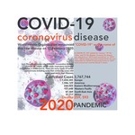
This poster was the final project in the spring 2020 semester of Graphic Design I (VAD 411), taught by Misty Thomas-Trout, assistant professor of art and design. Following the transition to all-remote learning on March 23, 2020, in response to the COVID-19 pandemic, students in the class drew from data, health information, news coverage, personal reflections and other sources to create this work.
-
Final Project: Claire Brewer
Claire Brewer
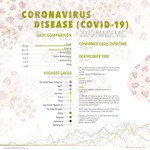
This poster was the final project in the spring 2020 semester of Graphic Design I (VAD 411), taught by Misty Thomas-Trout, assistant professor of art and design. Following the transition to all-remote learning on March 23, 2020, in response to the COVID-19 pandemic, students in the class drew from data, health information, news coverage, personal reflections and other sources to create this work.
-
Final Project: Eman Alshafai
Eman Alshafai
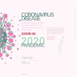
This poster was the final project in the spring 2020 semester of Graphic Design I (VAD 411), taught by Misty Thomas-Trout, assistant professor of art and design. Following the transition to all-remote learning on March 23, 2020, in response to the COVID-19 pandemic, students in the class drew from data, health information, news coverage, personal reflections and other sources to create this work.
-
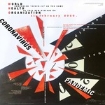
Final Project: Emily Cordonnier
Emily Cordonnier
Inspired by the Russian Constructivism movement over 100 years ago, this piece pays homage to the parallels that exist in 2020 and that we are still grappling with in our society. The Russian Revolution of the 1920s brought a philosophy and design movement that was aimed to reflect modern industrial society and urban spaces that favored art, design, and architecture for practical and social purposes. The movement’s design was based on construction from products of society or what was in the studio, home, or office. The modern-day feeling of unrest and contempt for not having enough resources to survive living in the United States, a “first-world country,” during a pandemic sparked social and political revolutions across the nation. For this composition, I drew inspiration from El Lissitzky’s Beat the Whites with the Red Wedge, a 1920 Soviet propaganda poster.
-
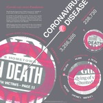
Final Project: Grace Burke
Grace Burke
This poster was the final project in the spring 2020 semester of Graphic Design I (VAD 411), taught by Misty Thomas-Trout, assistant professor of art and design. Following the transition to all-remote learning on March 23, 2020, in response to the COVID-19 pandemic, students in the class drew from data, health information, news coverage, personal reflections and other sources to create this work.
-
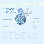
Final Project: Kathryn Niekamp
Kathryn Niekamp
This poster was the final project in the spring 2020 semester of Graphic Design I (VAD 411), taught by Misty Thomas-Trout, assistant professor of art and design. Following the transition to all-remote learning on March 23, 2020, in response to the COVID-19 pandemic, students in the class drew from data, health information, news coverage, personal reflections and other sources to create this work.
-
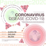
Final Project: Lucy Rauker
Lucy Rauker
This poster was the final project in the spring 2020 semester of Graphic Design I (VAD 411), taught by Misty Thomas-Trout, assistant professor of art and design. Following the transition to all-remote learning on March 23, 2020, in response to the COVID-19 pandemic, students in the class drew from data, health information, news coverage, personal reflections and other sources to create this work.


