
-
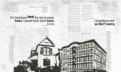
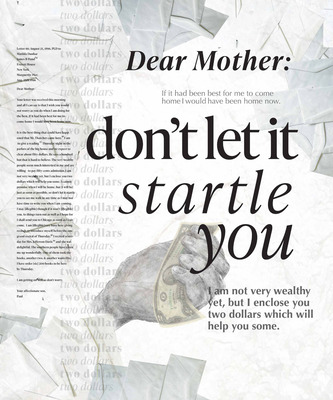
Your Affectionate Son, Paul
Isabella Winkler
Dimensions: 30 inches wide, 36 inches tall
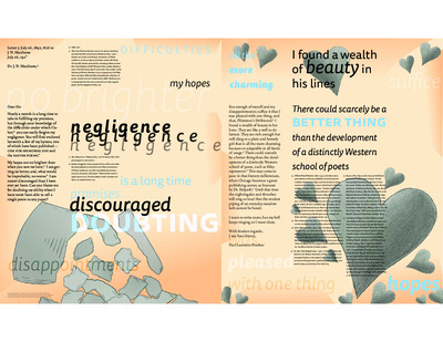
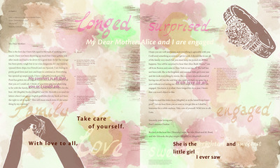
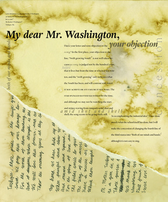
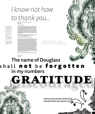
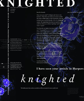
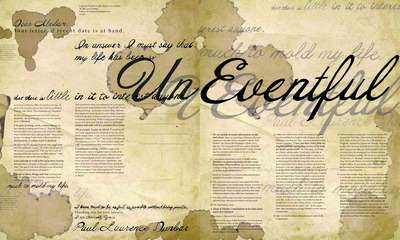
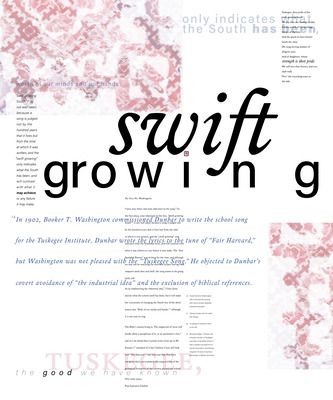
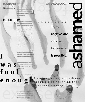
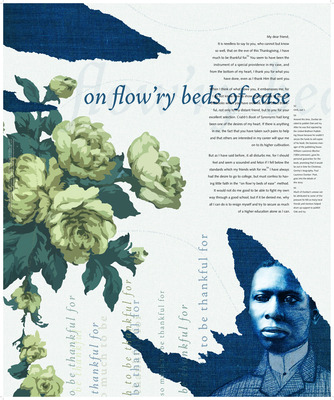
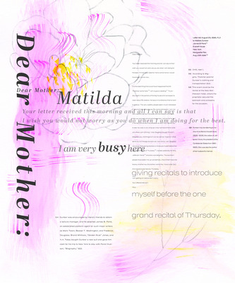
Inkjet on matte paper, printed on both sides.Artist's narrative: Letter 66 is a heartfelt reminder written by Dunbar to his Mother, Matilda, in order to ease her mind of anxieties about her son being gone to New York for readings. Dunbar explains to his mother that he is optimistic about his time in New York so far and believes that it is only going up from there. He elaborates that the people in the area seem to be very interested in him and his work. He is having great success so far and she should not fear for him. He claims he is doing so well that he may not even be able to tell her when he may show back up due to a lack of time in his busy schedule and the demand for his readings. He then goes to sign the letter with, “I am getting on well so don’t worry. Your affectionate son, Paul.” Implemented are the two ideas of worry and anxiety alongside this idea of prosperity present and they are compared to what they mean to the letter. The imagery represents two main ideas. The peony represents prosperity and the lilac represents worry and anxiety. With this idea in mind, I paid attention to how Dunbar closes the letter. He signs it as “Your affectionate son, Paul.” The word affectionate solidified the rest of this poster for me. It was what continued to influence the type palette, which consists of Abril Display designed by Jośe Scagilon and Veronika Buria, and Henderson Sans designed by Alejandro Paul, as well as the rest of the design choices. This poster was meant to bring the overall idea of affection, whether that be from mother to son or from son to mother.
Printing is not supported at the primary Gallery Thumbnail page. Please first navigate to a specific Image before printing.